Trends & Environment.
Task 11:
This week's task is centered around thorough research and analysis. We are tasked with exploring either Case Study 1 or Case Study 2, gathering visual examples, and then integrating our findings into a concise 500-word critical review. Case Study 1 involves investigating a single story's global reporting, where we are required to collect three versions of the story from three distinct countries. Conversely, Case Study 2 prompts us to examine how a brand is presented across different countries, considering sectors like alcohol, tobacco, transport, and cars. Our examination should also encompass how media influences our comprehension of visual signs and symbols in relation to the chosen subject. Personally, I engaged with this week's challenge quickly and with ease, dedicating only a limited amount of time and effort to it.
Learning objectives:
Understand and research semiotics and symbolism
Analyse a story or a brand and how it is delivered in different global contexts
Imagine how how society is manipulated by a message and how graphic design is deployed
Document and communicate your working process on your blog
Participate in and reflect upon debate on the ideas wall
Case Study :2
Part 1 Symbolism and semiotics
Part 2 Case study
Part 3 Patrick Thomas Breaking News 2.0 Installation
Chosen brand:

Evolution of Adidas throughout the years:
Over the years, Adidas has updated its logo to reflect its changing brand identity, modernise its image, gain global recognition, distinguish itself from competitors, and respond to market and design changes. Every logo iteration reflects Adidas’ evolution as a brand and the company’s ambition to remain at the forefront of the sportswear and fashion industries.

Adidas Arabic Logo:


Mo Kotait was one of the key players in the winning pitch and helped create an Arabic branding that matches the English one. One of his exceptional contributions was designing the Arabic typeface that went along with the English one so seemingly. It was a tricky process because it needed to blend the visual elements of the two languages while still keeping the brand’s core.
But Kotait was able to bridge the gap between the two languages and ensure the Arabic branding had the same spirit of Adidas as the English one and resonated with the Arabic audience. It’s a great example of creative thinking, adjusting to cultural differences, and playing a significant role in making the “impossible is nothing” campaign work in Arabic.
IMPACT BBDO and Adidas launch the Arabic iteration of new “Impossible is Nothing” campaign

The ‘Impossible Is Nothing’ campaign is Adidas’ most ambitious women’s campaign, celebrating those who break boundaries and champion gender equality in sport and beyond. To translate the message into Arabic, IMPACT BBDO needed to find a way to include the logo’s three stripes in the alphabet. In the English version, the logo forms the letter M in “I’m”, while the Arabic version cleverly incorporates the logo into the letter S, keeping the original message intact. The solution came from the word “impossible” itself. The Arabic adaptation is now featured on outdoor boards across the UAE and is an integral part of the social media campaign that features local influencers and sports stars.
500-word written critical review:
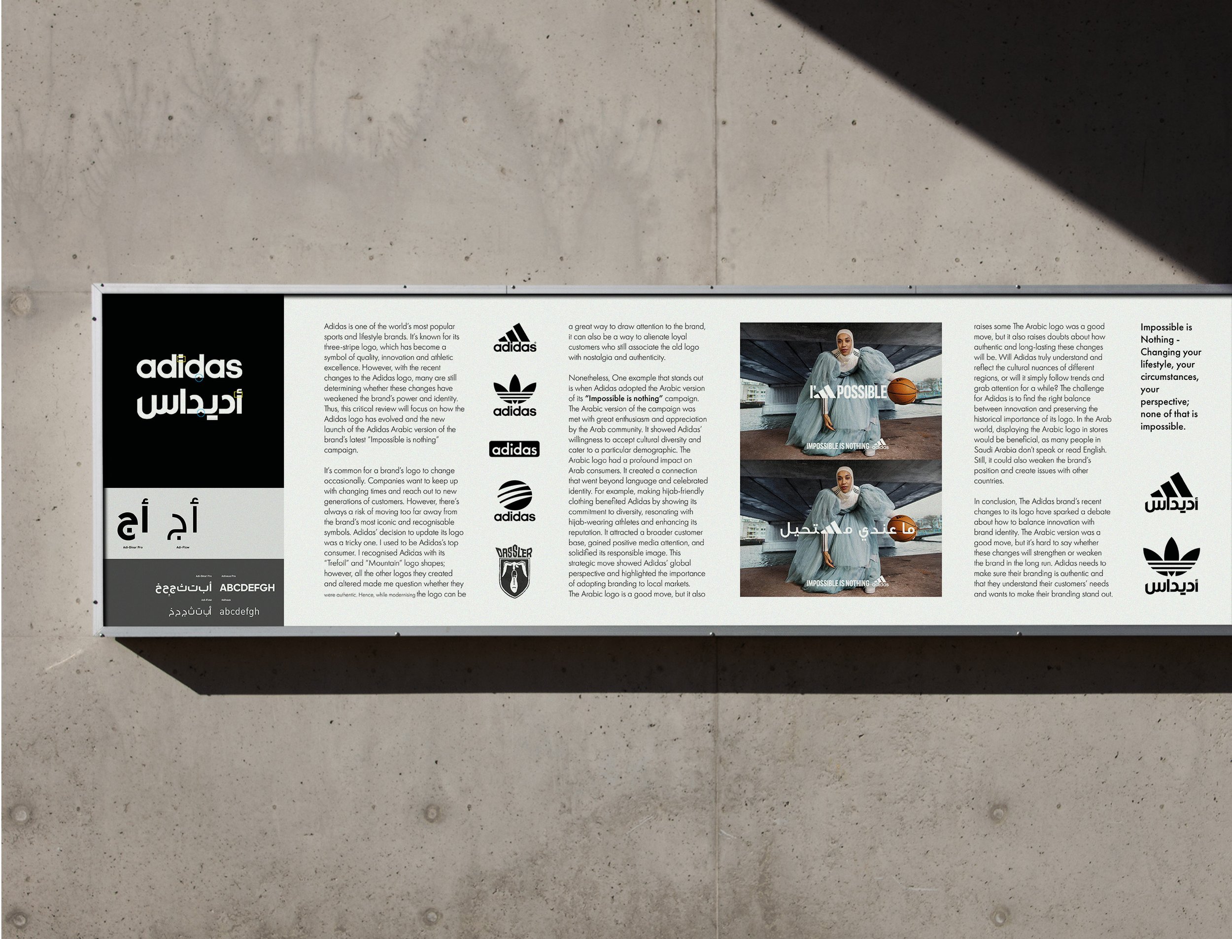
Adidas is one of the world’s most popular sports and lifestyle brands. It’s known for its three-stripe logo, which has become a symbol of quality, innovation and athletic excellence. However, with the recent changes to the Adidas logo, many are still determining whether these changes have weakened the brand’s power and identity. Thus, this critical review will focus on how the Adidas logo has evolved and the new launch of the Adidas Arabic version of the brand’s latest “Impossible is nothing” campaign.
It’s common for a brand’s logo to change occasionally. Companies want to keep up with changing times and reach out to new generations of customers. However, there’s always a risk of moving too far away from the brand’s most iconic and recognisable symbols. Adidas’ decision to update its logo was a tricky one. I used to be Adidas’s top consumer. I recognised Adidas with its “Trefoil” and “Mountain” logo shapes; however, all the other logos they created and altered made me question whether they were authentic. Hence, while modernising the logo can be a great way to draw attention to the brand, it can also be a way to alienate loyal customers who still associate the old logo with nostalgia and authenticity.
Nonetheless, One example that stands out is when Adidas adopted the Arabic version of its “Impossible is nothing” campaign. The Arabic version of the campaign was met with great enthusiasm and appreciation by the Arab community. It showed Adidas’ willingness to accept cultural diversity and cater to a particular demographic. The Arabic logo had a profound impact on Arab consumers. It created a connection that went beyond language and celebrated identity. For example, making hijab-friendly clothing benefited Adidas by showing its commitment to diversity, resonating with hijab-wearing athletes and enhancing its reputation. It attracted a broader customer base, gained positive media attention, and solidified its responsible image. This strategic move showed Adidas’ global perspective and highlighted the importance of adapting branding to local markets.
The Arabic logo is a good move, but it also raises some The Arabic logo was a good move, but it also raises doubts about how authentic and long-lasting these changes will be. Will Adidas truly understand and reflect the cultural nuances of different regions, or will it simply follow trends and grab attention for a while? The challenge for Adidas is to find the right balance between innovation and preserving the historical importance of its logo. In the Arab world, displaying the Arabic logo in stores would be beneficial, as many people in Saudi Arabia don’t speak or read English. Still, it could also weaken the brand’s position and create issues with other countries.
In conclusion, The Adidas brand’s recent changes to its logo have sparked a debate about how to balance innovation with brand identity. The Arabic version was a good move, but it’s hard to say whether these changes will strengthen or weaken the brand in the long run. Adidas needs to make sure their branding is authentic and that they understand their customers’ needs and wants to make their branding stand out.
Example 1:

Example 2:

Outcome:
Case Studies:

PART 1:
In Martin Hosken's lecture, I learned a lot about the theory and symbolism behind messages. He focused on the complex composition of messages, which includes the sender, the intention, the context, the medium, the transmission, and the receiver. This discussion highlighted the importance of intention and language in effective communication. He also highlighted how symbols and signs convey meaning. He introduced semiotics and studied signs and symbols to comprehend communication dynamics better. He discussed the building blocks of sign-signifier and signified. He also highlighted the differences between icons, indices, and symbols and how they convey different meanings. Exploring the importance, complexity, and impact of context shows how symbols evolve. At the end of the lecture, he encouraged listeners to look for signs and symbols around them to foster a better understanding of communication codes. The talk enriched my understanding of how symbols and signs communicate and decipher messages.

PART 2:
I learned a lot from Tom's talk at Regular Practice about how global graphic design intersects with national identity. Using the Olympic Games as a case study, Tom discussed how modern design is influenced by technology and awareness of international contexts. Tom mainly focused on how the Olympics reflected the host country's identity. Exploring the systematic, symbolic and abstract design techniques, Tom showed examples from different Olympic Games. It's easy to see how design choices reflect a country's unique character.
By comparing the simple visuals of the historical Olympics to today's semiotic-driven designs, Tom showed how the focus shifts from simply conveying an event to symbolising the host country's character. This highlighted the dynamic relationship between global context, design decisions, and the ongoing foundation of the sporting event.

PART 3:
There are two main ways in which people interact with the exhibition. The first is by using iPhones. The second uses a primary terminal, a Raspberry Pi, something I had never heard of. Both of these methods allow the audience to type in their own headlines. The idea behind the exhibition is to celebrate freedom of speech while also commenting on the reliability or lack of reliability of modern media. I gained a deeper understanding of the central purpose of the installation, which is to raise inquiries about the reliability of news. It made me think about my relationship with the info I consume. It made me question its origin and the credibility of the information I received. Then, the focus shifts to truth and how we process the information in the world around us. The project reminds us that a story can take on different meanings depending on how it's presented, making the search for truth even more challenging. I learned much about media credibility, the perception of reality, and the complexities of news interpretations in different cultural contexts.
Reflection:
This week's assignment took up most of my time and effort but could have been more enjoyable. I didn't enjoy this assignment at all because of the stress level I'm currently experiencing. Writing a 500-word assessment was extremely difficult. I had an artist's block and found it challenging to think and compose. I did it, though, and I'm proud of myself. If I had more time, I would have explored more and tried to create something that represented Adidas somehow. For example, I wanted to make cards or brochures with the Arabic logo design and give them to people to see if they knew it was Adidas or if they didn't. All in all, I learned something new, which is always good, but I wouldn't say I liked the process.