Story Told.
Task 2:
This week's challenge focuses on collecting many pressing issues discussed in our local community. We'll examine the communication tactics used to raise awareness of these issues, determining what worked, what didn't, and what could be improved. So, I approached this task by stepping outside and observing my surroundings. I tried to identify significant issues in Bournemouth, a coastal city where I reside. One of the prominent issues was the area's faded and covered typographic signages. Therefore, I decided to capture pictures of this minor issue, which could escalate into a more significant problem in the future and think about ways to help solve this problem.
Learning Objectives:
LO2: Contextualise – appraise the social, political and historical contexts in which design practice operates.
LO3: Analyse – evaluate research findings and use sound judgement informed by critical debate at the forefront of the academic discipline.
LO4: Distil – position a creative strategic insight that has been distilled and refined through an informed investigation.
LO6: Make – select and utilise relevant tools, skills and technologies in the delivery, iteration and sustainable production of an outcome.
LO7: Collaborate – demonstrate inclusive and empathetic strategies to plan and execute a project across distributed collaborative situations.
LO8: Design – realise a final solution that evidences its strategic journey and clear relationship between form and function.
Workshop Challenge:
Photographs of faded & covered typographic signages:


Examples of a possible solution:
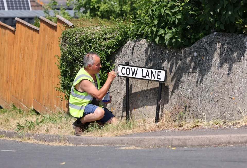
"It's almost my plan to embarrass the council into taking some action."
Swanage resident Rob Nunn has taken on a very worthy project. Not only is he paying tribute to the town's history, but he's also helping to revitalise its visual environment. He's spending his time and energy restoring the fading signs of Swanage. It's not just a matter of preserving tradition; it's a matter of improving the community's visual appeal. These signs, worn down by time and the elements, tell the story of Swanage's history. They're a reminder of the places, the streets, and the businesses that have always been at the heart of the community. Nunn's work is meticulous and accurate, combining artistry with historical integrity. When Nunn restores these signs, he's not just giving them a new coat of paint. He's bringing life back to the visual landmarks that tell the story of Swanage for locals and tourists alike. This isn't just about beautifying. It's about restoring Swanage's identity, ensuring that its history isn't lost to the elements but that it's alive and accessible for future generations.


When planning my projects, I always consider if they will contribute positively to the community, rather than being purposeless creations. Rob Nunn's initiative deeply inspired me. He tackled a need for improvement head-on, unconcerned about costs or personal gain. His motivation was simply to enhance the world around him, which truly touched me. Consequently, my project will aim to make a meaningful impact, leaving a lasting mark on the world without expecting anything back. I'm driven by the desire to do good, much like Rob, focusing on the difference we can make, not the rewards we might receive. Rob Nunn's project has really captured the hearts of the local community, raising awareness and admiration for local history. It reminds us why it's essential to keep our visual history alive and how people can play a part in keeping a town's history alive. Rob Nunn isn't just restoring signs; he's making Swanage a better place- where history isn't forgotten and celebrated.
Project’s Process:
Brainstorming Ideas + thinking out load:
Pinterest images that inspired me:


Initial Idea generation:


Case Studies:


In the podcast titled "Reforming and Projecting a New Future in Type Design" featuring Stuart Tolley and Colophon Foundry, the discussion revolves around the evolution of type design and its future prospects. The conversation emphasizes the need for type designers to embrace change and innovation while respecting the rich heritage and tradition of typography. Stuart Tolley and Colophon Foundry explore how technology and cultural shifts are shaping the field, and they highlight the importance of adaptability and creativity in pushing the boundaries of type design. Overall, the podcast delves into the dynamic nature of type design, emphasizing the balance between tradition and progress in shaping its future.
Contextual Research:
Dan Rhatigan:
The Ryman Eco HD video with Dan Rhatigan talks about the evolution of typography and the principles behind it, especially concerning Ryman Eco. Ryman Eco is a sustainable, eco-friendly, and visually appealing typeface designed for the Ryman Stationery brand. In the video, Dan discusses the creative process behind the design of the Ryman Eco typeface and emphasizes the importance of readability, legibility, and sustainability when designing a typeface. Watching this video was a great learning experience for me. I learned a lot about typography. I learned more about the craftsmanship and the considerations that go into designing a typeface that looks great and is environmentally conscious. Dan Rhatigan's expertise and explanations helped me understand typography better. I gained a better appreciation for the art & science behind fonts and how they impact design and sustainability.
SeoulHangang:


Whatever it isIn 2019, Seoul introduced a unique new font called "SeoulHangang," inspired by the Han River that flows through the city. This font is exceptional because it's designed to show Seoul's unique feel and spirit. Each letter in the font has its own style, just like different parts of the city have their character. The letters' curves are like the river's waves, reminding us of Seoul's beauty and energy. This font does more than look good; it tells the story of Seoul and makes you feel connected to the city. It's a great way to see how design can capture the heart of a place and share its story with everyone.
Seeing Seoul's "SeoulHangang" font, inspired by the Han River, changed how I view typography. It showed me that fonts can capture the essence of a place or idea, turning typography into an art form full of meaning. This inspired me to get creative and start making my typefaces from anything I find around me. From nature to city scenes, everything has the potential to be turned into a unique font. , the way you tell your story online can make all the difference.
DIA: smlXL


One of the best things about SMLXL DIA's branding is its straightforward and fun use. Their typography is simple but effective, making it easy to remember and interact with their brand. Listening to them in Stuart's webinar was an inspiration. It made me realize how vital simple design could be and encouraged me to incorporate simplicity and creativity into my work. Their brand approach is an excellent example of how simple things can make a big difference.
Self-Reflection:
This week's challenge was exciting, but I had little time to dive into it, so I had to improvise and rush through the task. What surprised me was how much Rob's work on road signs inspired me to concentrate on repairing what's already damaged or neglected instead of always chasing new concepts and overlooking what needs attention. Even though I didn't dive deep into designing this week, I did jot down some of the first things that came to mind during my research. While these ideas aren't necessarily final, they are a good starting point.