Research & Discover.
Starting the 750 module feels like the beginning of a new chapter in my life. There’s a mix of fear about the challenges ahead, but I’m also excited about the unexpected opportunities and the "hidden sunrises" waiting to unfold. As with every project, I want to ensure I stay true to myself and not lose my identity in the process. I believe my personal involvement is what makes my work unique and sets it apart from others.
Because we had so much time to think about our Final Major Project, I’ve started to form an idea of the topic I want to pursue, though it’s still in its early stages. The word "change" has been on my mind for the past three months. I’ve been seeking change in my own life, and while I’ve made a few adjustments, I’ve realized that I’m craving something bigger—something that goes beyond my personal life and has an impact on the world. So, for my Final Major Project, I’m certain that the word "change" will be central. It’s such a broad concept, rich with possibilities, and I’m eager to explore where it leads as I move forward with the project.
For this module, I’ll begin by answering key questions to help me define my research question and shape my approach to both design and research. Alongside this, I’ll reflect on the typefaces I’ve created throughout my journey because typography is my area of expertise, and it’s what defines me as a designer. My aim is to graduate from this Master’s course with a project that not only showcases my skills but also reflects how typography has shaped me as a designer and as a person. By integrating my personal experiences into this project, I hope to create something that stands out and, ultimately, demonstrates the transformative power of design in my life.
What is my research question?
How might I...?
Who is this for?
PREVIOUS TYPEFACES I CREATED


Typography, for me, has always been more than just shapes and letters. It’s a living form that reflects my evolving self. Each typeface I’ve created represents a specific feeling or addresses a particular problem, with the typeface itself acting as the solution. When I look at all my typefaces, I feel a deep sense of pride and connection. Typography is what defines me; it’s my way of solving problems and communicating without words. I can simply express my message through strokes, lines, colors, and all the elements that make up type.
During my discovery process, I was particularly inspired by a typeface I created called "Beastie." In this project, I was tasked with imagining a world where writing never existed and had to create a new language system using materials collected for the Natural History Museum. I chose to base the typeface on creatures with unique shapes and forms. The term "glyph" itself holds various meanings across cultures. In archaeology, a glyph is a symbol, like ancient Egyptian hieroglyphics, that conveys an object or action through imagery. In typography, however, a glyph is a symbol designed to represent a readable character for writing. As Rumi once said, "Speak a new language so that the world will be a new world," and this project gave me a glimpse of how creating a new language could reshape the world.
This project was a part of my BA course, and while creating a new language is a powerful concept, I’m now more focused on how the theme of "change" can be reflected in typography. So, as I begin my research, my focus will revolve around these two key words: "change" and "typography."
The following images closely mirror what I aim to explore through the concept of "change." It demonstrates, step by step, how objects from the Natural History Museum transformed into a new visual language. The first image shows the original objects, which were then converted to black and white, then simplified into silhouettes, followed by pictograms, and finally into glyphs. If you compare the first and last images, they seem completely unrecognizable, but when you view the progression, the transformation becomes clear.
This method of breaking down change into distinct stages has greatly influenced my design thinking. It highlights how everything around us is capable of evolving even objects that have remained unchanged in a museum for decades can be repurposed and seen in a new light. It underscores the idea that change is inevitable, constantly reshaping the world around us. With this in mind, I want to create a brand that embodies "change," using typography as the main component to reflect this constant evolution.


These are hand-drawn illustrations created with ink and white paint, which were then incorporated into the type specimen book as transparent overlays.


As I’ve mentioned before, I want to focus my FMP on the concept of change because this year has been especially transformative for me. Change happens every day, but there are different types of change, and since it's such a broad concept, I want to explore it on a more personal and deeper level. To do that, I need to first understand what change truly means, both to myself and others. To gather insights, I created a survey to ask people about their thoughts on change, hoping their responses will inspire new ideas for my project.


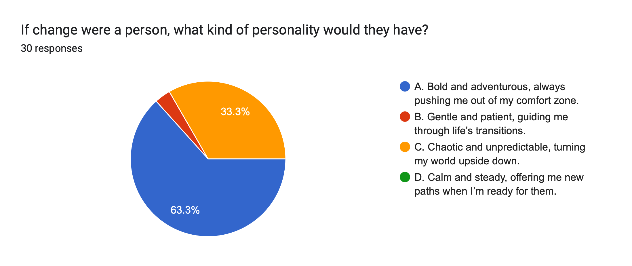
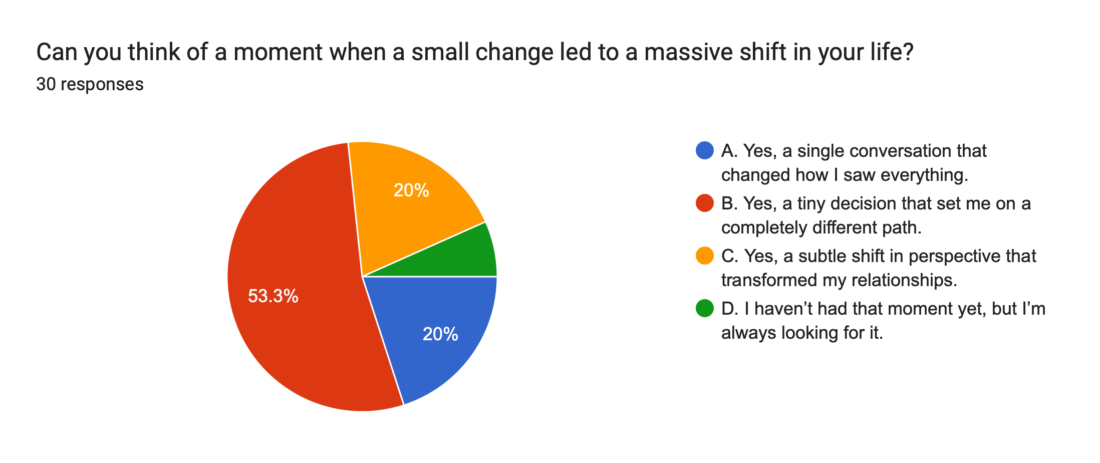


The survey responses really showed me how differently people see change. Some saw it as a chance to grow, while others found it unsettling and hard. What really stood out to me was how many people said change is both difficult and rewarding, shaping their lives in unexpected ways. Even small decisions could lead to big changes in their lives. As one person said, "A single conversation changed how I saw everything." That really stuck with me because it shows how even small moments can be so powerful.
I also got feedback from several people who said the questions really touched them. Some said it made them rethink their life choices, while others were excited about what these questions could lead to and what the project might become. Hearing that feedback was really encouraging and made me feel even more confident in this idea. Now that I’ve gotten people’s attention and made them think deeply, I feel like I have a strong place to start. The positive comments gave me the confidence to keep going with more focus and determination.
Contextual Research:
In the first phase of my research, I will focus on gathering contextual studies from various websites, articles, and visual resources. Rather than providing a detailed analysis of what I learned or what inspired me from each source, I believe that simply engaging with the visuals and key ideas will stimulate my creativity more effectively. By observing and absorbing this material, I can develop my own context and generate unique ideas. This method allows me to stay flexible and open-minded, which is crucial for the early stages of my project. My aim is to visually explore and reflect on these resources, using them as a foundation to shape the direction of my work without being constrained by written interpretations.


Exploring Various Aspects of “CHANGE”
Emotions & Mental States:

Our emotions shift throughout the day, influenced by experiences, interactions, and our bodies. We can quickly move from happy to stressed or calm to anxious, making emotions unpredictable. These changes affect our moods and mental focus.
Personal Habits and Routines:
Our daily routines, like work, sleep, and exercise, change based on mood, energy, and external factors. These habits aren’t fixed but shift throughout the day. We constantly adjust our routines to fit what’s happening around us
Environmental Changes:

The environment is always changing, with daily shifts in weather, temperature, and air quality. These natural cycles impact both ecosystems and daily human activities. Every day, the world around us is in a constant state of flux.
Technology and Data Flow:
Technology and data flow are always changing in real-time, from internet traffic to social media updates. The digital world is in constant motion, shaping modern communication and connectivity. This endless exchange of data impacts everyday life.
Cultural & Societal Changes:

Societies and cultures evolve constantly, influenced by trends, news, and social movements. Public opinions and moods shift quickly, especially with social media. This rapid change shapes how people engage with the world around them.
Biological Cycles:

Our bodies are in constant cycles of growth, decay, and regeneration at the cellular level. Cells are continuously breaking down, repairing, and regenerating to keep us healthy. This daily process ensures the body’s renewal and function.
What is it that intrigued me to choose biological cycles?
Biological Cycles
Growth
-
Decay
-
Regeneration
-
Growth - Decay - Regeneration -
After exploring different types of change, the one that resonated most with me was biological cycles. Over the past three years, I’ve struggled with my health, going through cycles of getting sick and recovering. This personal experience made me want to create a project that reflects the ups and downs of life. As I looked deeper, I realized I wanted to focus on the natural cycles of the world around me, and more specifically, on the processes within my own body—how cells grow, decay, and regenerate. This concept of change sparked an idea to create a brand that explores human and non-human biology, diving into cellular and molecular aspects of design. I began thinking about how design can serve a purpose in addressing these natural cycles of change.
The following Behance projects serve as a "Pinterest board" of various works that incorporate cellular art, design, and typefaces. I’m excited to continue exploring this concept in more detail, but for now, I’m feeling truly inspired.
creative “cellular” type & design projects:
In the first two weeks, I have to ask myself the following questions:
What is my research question?
What are the aims, objectives, and purpose of my research?
Who is the audience for my project?
How might I investigate my research question?
What historical or contemporary developments are relevant to my research area?
What connections can I draw between different aspects of my research?
What research methods should I use to explore my question?
What is my position in relation to my chosen area of research?
How will this project benefit me as a designer and researcher?
Who is this project for? How can I define my audience clearly?
RESEARCH QUESTION TAKE #1
first research question trial:
How can typography as a visual language be harnessed to mirror the cycle of change as a natural law of life?
Tutorial with Ben:
During my tutorial with Ben, I presented my idea of exploring the concept of change at the cellular and molecular levels in both human and non-human contexts. Ben responded positively to my research question, finding it a strong starting point for my project. He offered insightful guidance, suggesting that I focus on medical change and cellular change, particularly how change at the molecular or cellular level can be explored in humans and non-humans alike. He emphasised the importance of considering typographic treatments in relation to cellular structures in plants and humans, asking me to reflect on which specific structures I want to incorporate into my work.
Ben also encouraged me to think about several threads that could form the basis of my research paper, including generative typography, the use of GitHub, and how cellular structures in human and non-human beings can link to design. He also recommended that I explore grid structures and how they relate to both human and non-human subjects. Additionally, he mentioned Donna Haraway, who challenges the anthropocentric idea that humans are superior to all living things, which is relevant to my interest in human and non-human cellular structures. We also discussed how Nida, my classmate, is exploring grids and systems of patterning in her work, which aligns with my ideas, providing a valuable cross-reference.
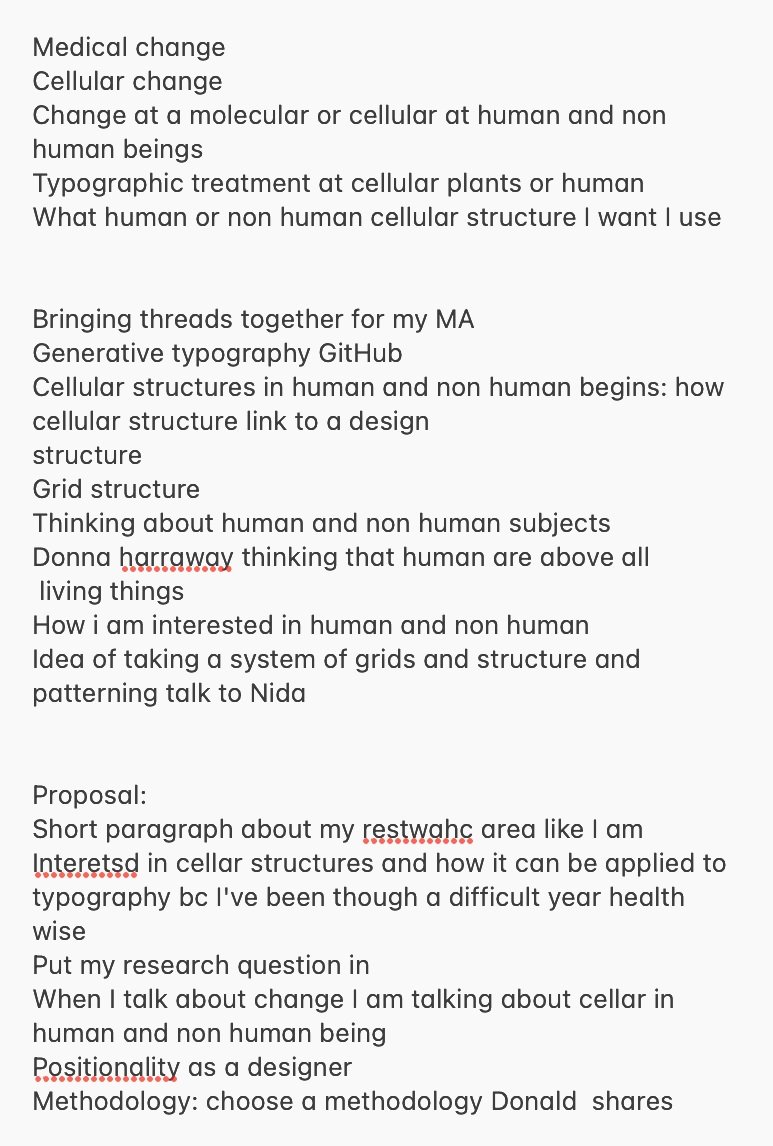
For my proposal, Ben advised that I begin by writing a short paragraph outlining my research area. I should emphasize my interest in cellular structures and how they can be applied to typography, especially considering my personal health journey. I will need to clearly define my concept of change as it relates to cellular structures in both humans and non-humans, and reflect on my positionality as a designer, focusing on how I want to express change through my work. For methodology, Ben suggested I explore Donald Schön’s approach to reflective practice to guide my research. All in all, this session was very productive, providing me with a clearer direction for both my project and my proposal.
Examples of previous students questions that were successful:


Ben encouraged me to be more detailed in my research question, similar to the example provided above. Thus, the following research questions reflect his feedback and suggestions for improvement.
RESEARCH QUESTION TAKE #2
Edited version of the research question after my tutorial with ben:
Q1: How can the dynamic processes of cellular and molecular change in both human and non-human organisms be visually represented through typography, using generative design to explore the relationship between biological structures and typographic form?
Q2: In what ways can generative design be used to visually represent the cellular and molecular processes of change in human and non-human organisms through typography, reflecting the connection between biological structures and typographic form?
Q3: How can the processes of cellular and molecular change in human and non-human organisms be translated into dynamic typographic forms, using generative design to explore the relationship between biology and visual language?
Q4: How can typography be designed to reflect the dynamic processes of cellular and molecular change in both human and non-human organisms, utilizing generative techniques to highlight the link between biological and typographic structures?
Previous Generative Typeface I designed “vista”


I've always been really eager to dive into the world of generative art, but during my BA, I found coding to be quite challenging and overwhelming. Because of that, I decided to look for other ways to get the same creative effects I was aiming for. Coding and tools like Processing require a lot of practice, but I found that Adobe Illustrator had similar tools that were much more accessible for me.
By holding down the (~) key while using the shapes tool, I was able to create a dynamic typeface without needing deep coding skills. This method helped me achieve the creative, visually engaging results I had in mind, and it felt more in tune with my workflow.


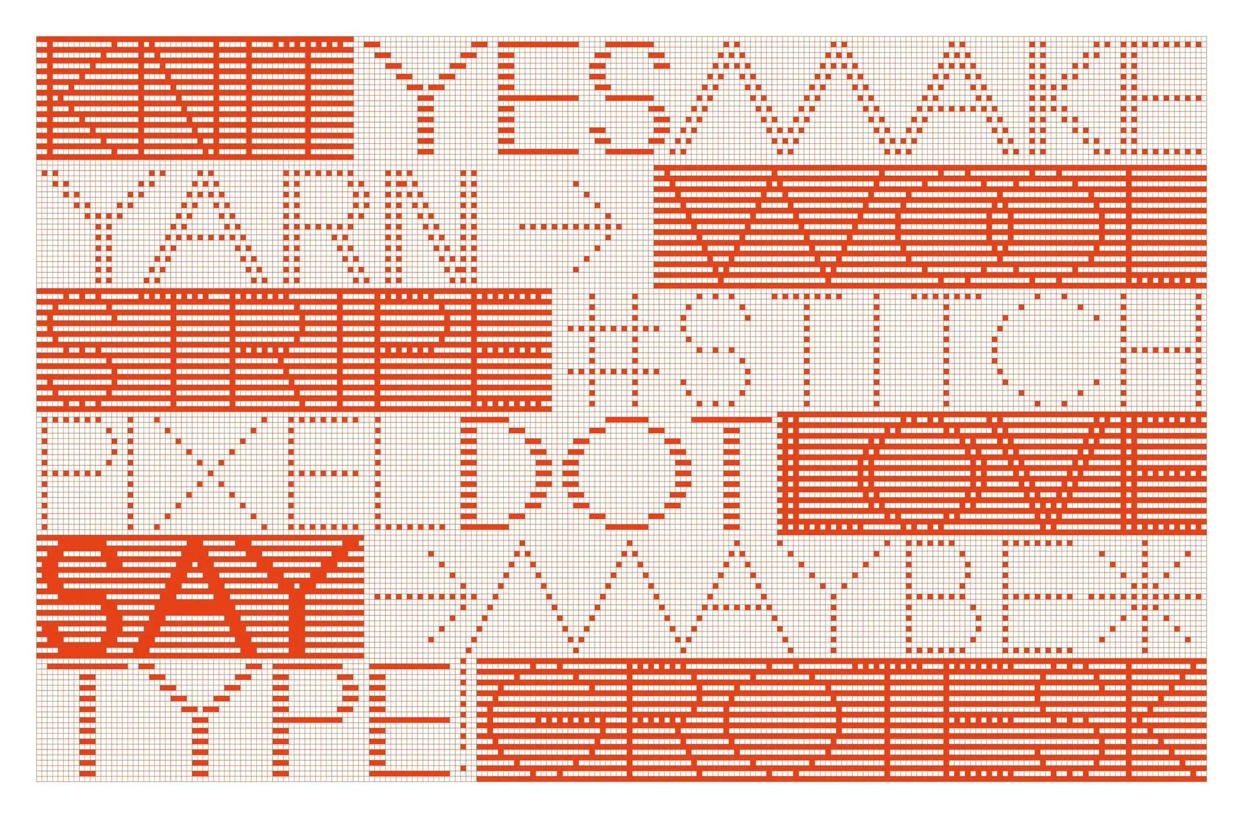
creative “generative” typography projects:


Counterbalance | Typographic Brand identity for “Oxford Brookes University BA Graphic Design show”
For my university's final show, I contributed by designing the typeface, but I was primarily responsible for receiving everyone's individual letter designs. I carefully edited them to ensure they were both readable and visually pleasing, making sure every detail was well-considered and refined.
Counterbalance referred to a weight or force that balanced another, often opposing, force or influence. It served to equalize or offset something, creating stability. In design terms, it suggested balance, equalizing, and counteracting forces to achieve harmony. For our group project, we were tasked with creating an identity system for the end-of-year showcase. This system needed to promote, inform, and visually organize the exhibition, considering various mediums such as a website, printed materials, and social media.
Additionally, the identity system had to offer a cohesive design for the exhibition space itself. We were provided with several shapes to work with and instructed to create the typeface using a grid system, ensuring consistency and structure. Our showcase was part of the larger Art School Showcase, meaning our work was displayed alongside pieces from other programs, including Fine Art, Photography, and Film, so the system we designed needed to stand out while aligning with the broader exhibition.
My process of creating different “letters” with different grid systems:
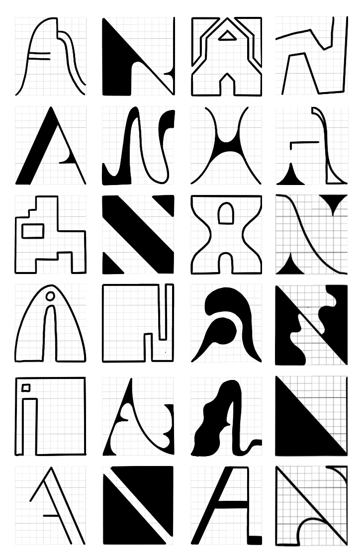


before editing it:

after editing it:


Creative ways to experiment with typography in endless ways:


The Galapagos Game is all about creative discovery and self-learning. It comes with 54 blocks printed with nine different geometric shapes, and you can use them to create endless combinations of letters, words, or even abstract designs. The blocks are made from white acrylic and screen-printed in blue, making it a fun and hands-on way to play around with typography and art. I found this project really inspiring, so I bought the game. I’m excited to start experimenting with it and see where it takes me. It ties perfectly into my concept of change, as the ability to constantly rearrange and manipulate the shapes reflects the idea of continuous transformation. I feel like it’ll be a great way to find inspiration and start building a solid foundation for my own project.
Ghada Wali's project was inspired by her visit to a European library, where she found only negative representations of Arabic culture. To change this, she used LEGO blocks to teach Arabic script in a fun and engaging way, blending graphic design with education to create a positive impact.
While her idea was incredibly creative and beautifully explained, it sparked a new perspective for me. I saw how LEGO could be used as a tool for creating endless typographic possibilities. This opened my mind to the potential of using LEGO as both a design and learning tool, offering an interactive and playful way to explore typography in new and unexpected ways.
Project Proposal | First Draft


