Design Development.
After completing phase two, my idea became much more defined and refined. The feedback I received during the external panel review was incredibly valuable and helped me organise my thoughts and solidify my direction. With their insights, I was able to gather strong research and begin sketching out my intentions, giving my project a clearer focus.
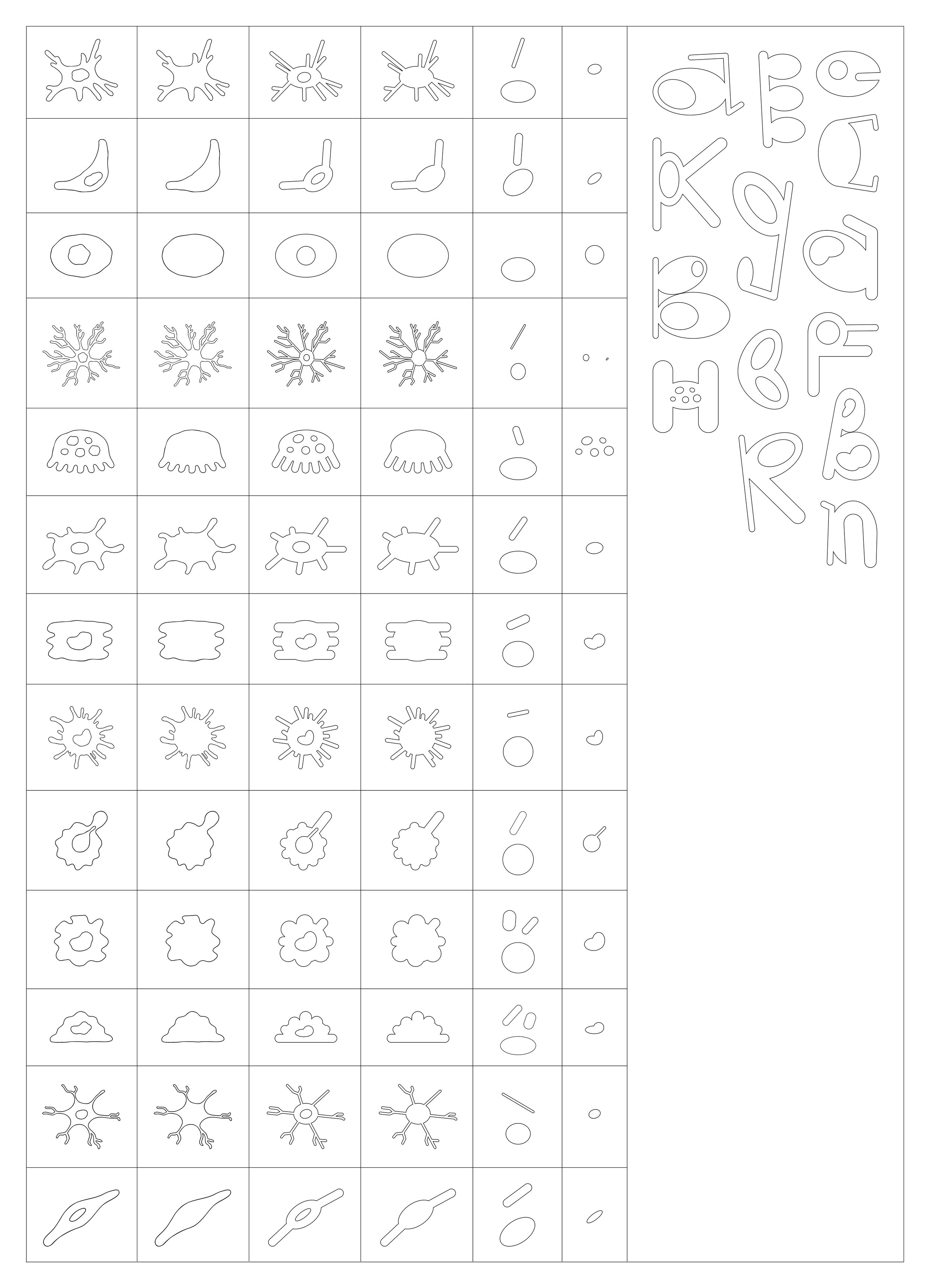
For phase three, I plan to bring my designs to life. This phase will involve developing my typeface by experimenting with different materials and techniques until I find the perfect fit. I will also start building the brand identity for my project, including creating the name, logo, tagline, and overall design system. These upcoming weeks will be pivotal in showcasing what my project is truly about. I also aim to document the process, including any failed attempts and challenges, as these will offer valuable lessons and opportunities for feedback.
As for my dissertation, I have yet to begin writing, but I will start by planning out my introduction and structuring the main body. This phase will bring everything together, combining the practical and conceptual aspects of my project into a cohesive narrative. There is a lot of exciting work ahead, and I am eager to see my project take shape.
Optimum Type book:


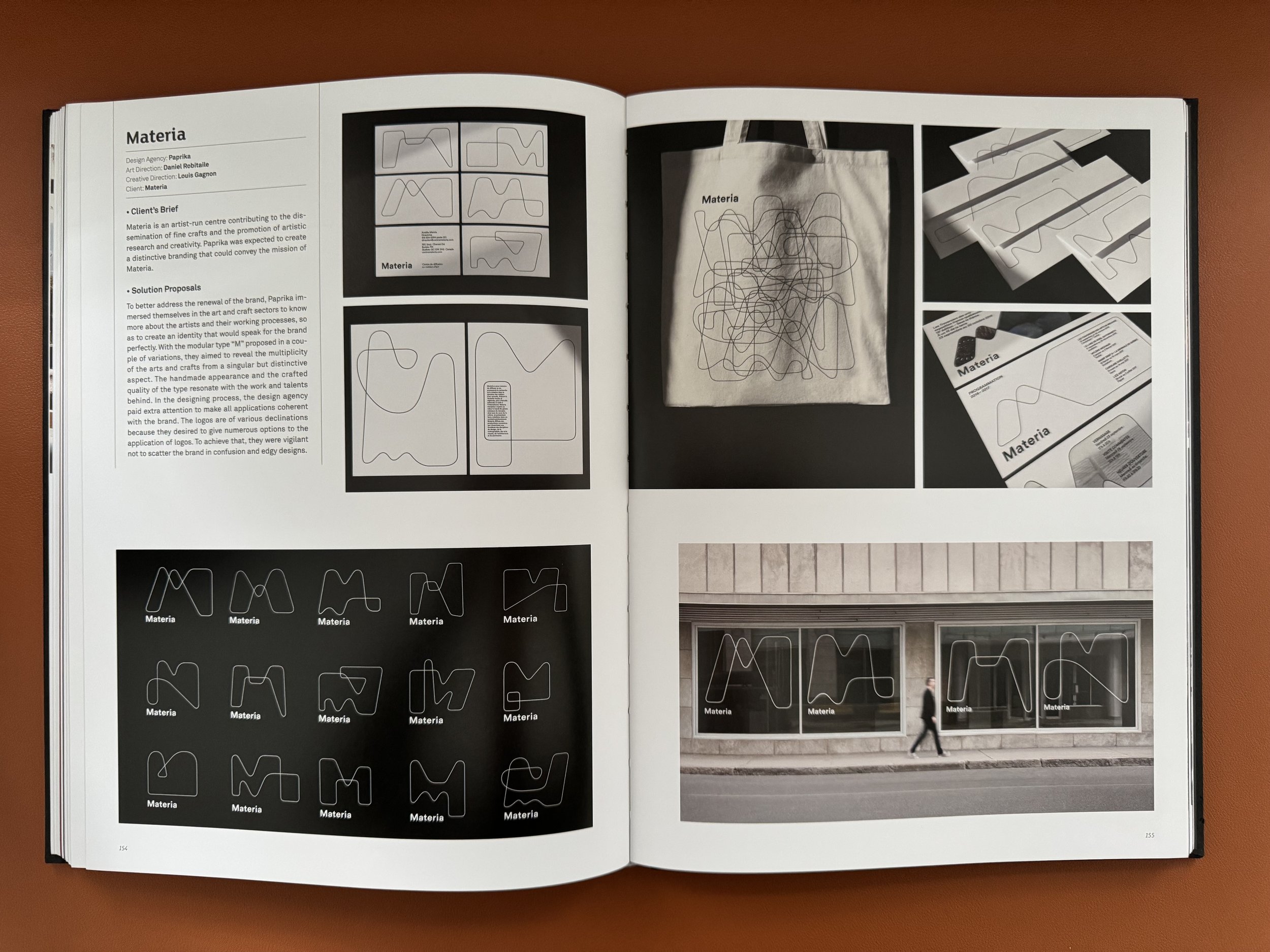


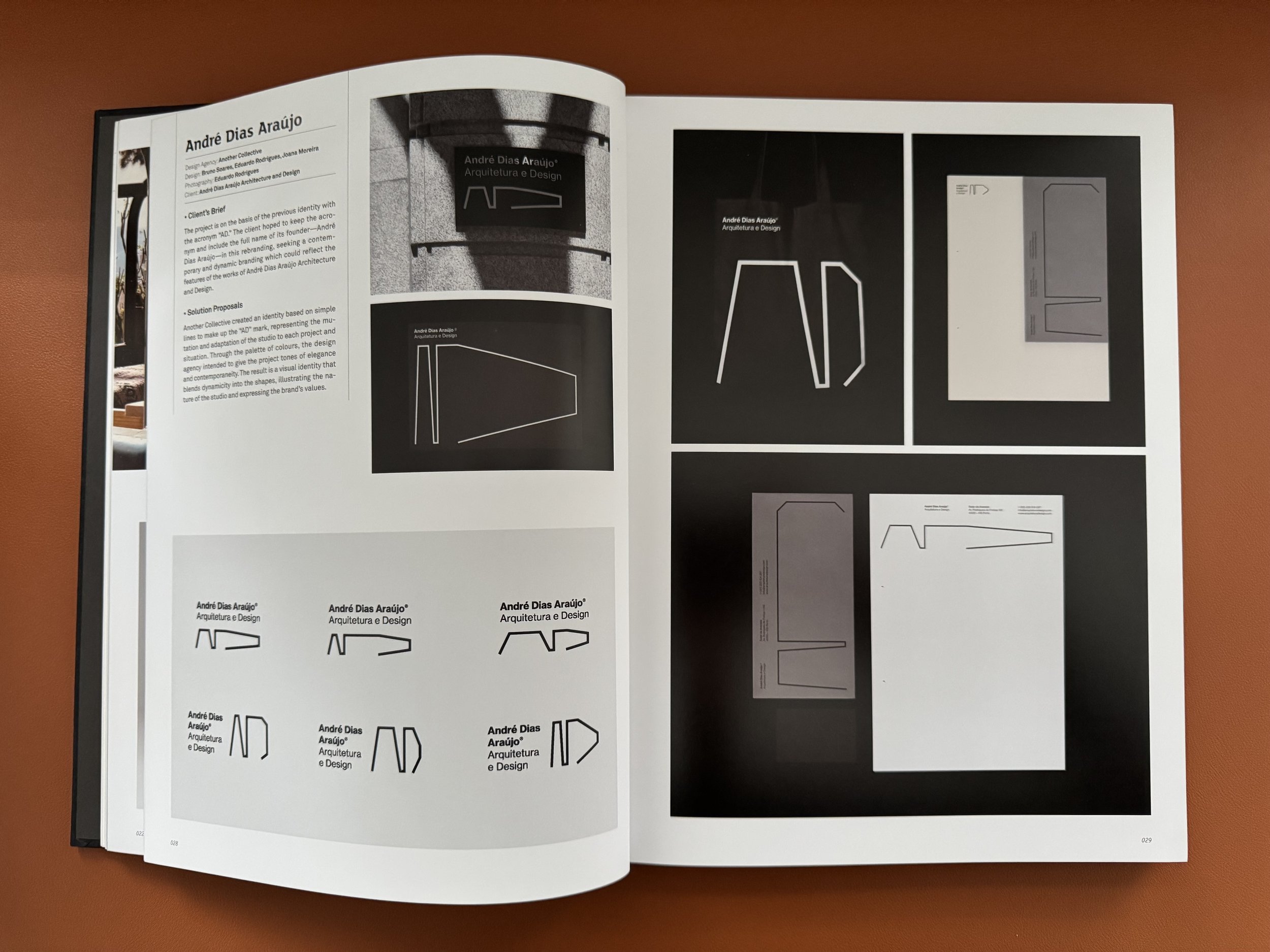


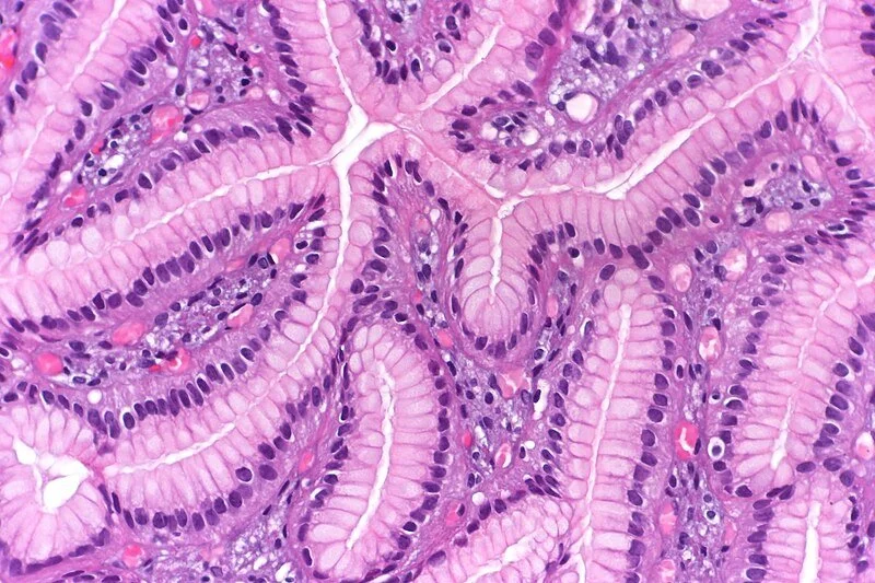
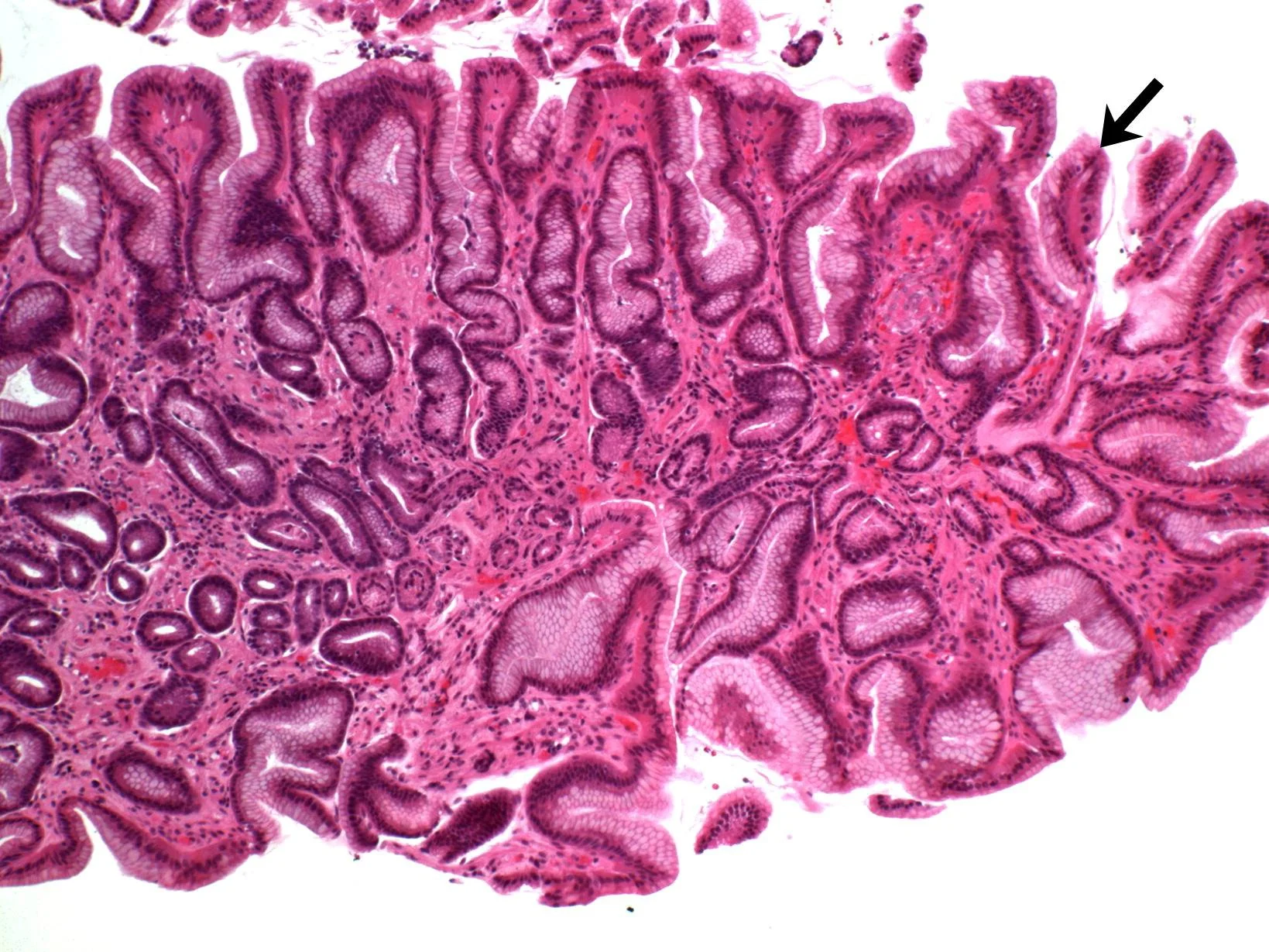
The Optimum Type book showcased a variety of innovative typography projects that helped shape my vision for representing the dynamic nature of macrophages through design. I was particularly captivated by Bandido by André Dias Araújo, which uses bold, expressive type to convey raw energy and rebellion, qualities that resonate with the adaptive and responsive behaviour of macrophages. Amlik inspired me with its celebration of cultural and linguistic heritage, reminding me of the importance of connecting my design to the human biological narrative. Alzheimer Nederland stood out as a deeply emotional project, using typography to reflect the fragility of memory, a concept that aligns with how macrophages play dual roles in both repair and dysfunction within the body. Similarly, Politan Row and Zetaly inspired me to think about how type can shape identity, encouraging me to design letterforms that reflect the shifting roles of macrophages, from defenders to responders. Materia pushed me to consider textures and materials, inspiring experiments that reflect cellular structures, while Buro Kade highlighted the adaptability of modular systems, much like the transformations macrophages undergo in response to different stimuli. These projects motivated me to use typography not just as a design element but as a storytelling tool, capturing the complexity, beauty, and adaptability of macrophages in my work.
Brand Identity Process
Brand Names:
Immuna
Cytotype
Macrophagia
MacroType
Typophagia
Bioglyph
Regenera
Phagotype
Shapeshifter
Cellscript
Taglines:
Designing Type From Cells
Letters Born From Cells
When Cells Inspire Type
Translating Cells Into Type
Where Biology Fuels Typography
The Fusion of Cells and Type
Shaping Cells Into Letters
When Biology Meets Type
From Cells to Typography
Transforming Cells Into Type
chosen ones:
Regenera
Letters Born From Cells
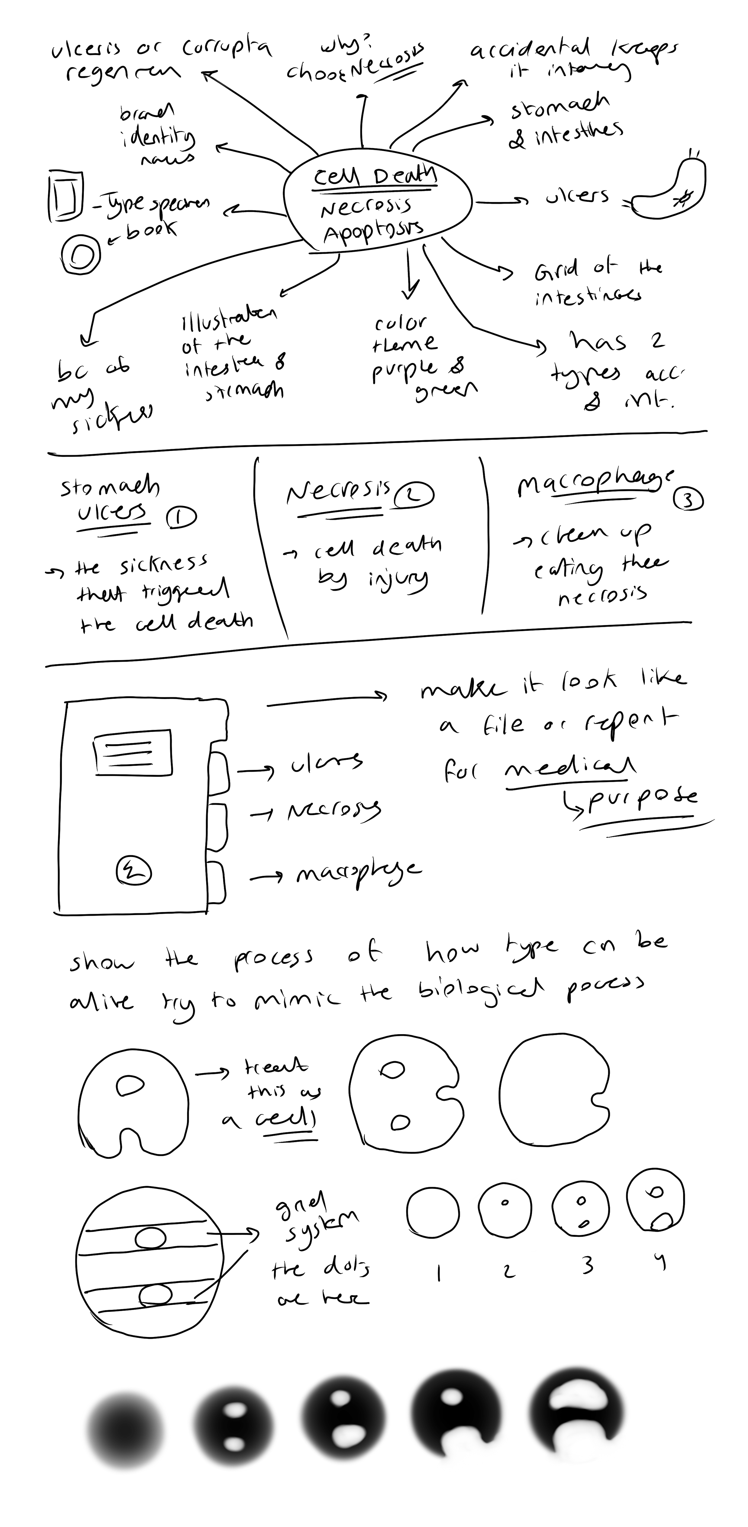
Initial Sketches:


CHANGE IN DIRECTION